

Case Study - Simplifying Digital Access for Multi-Generational Audiences
Redesigned a nonprofit website to make key tasks clear, accessible, and easy for members, volunteers, and stakeholders.
- Client
- Mansfield Historical Society
- Year
- Disciplines
- UX Strategy, IA, UI Design, Web Development, E-Commerce Integration

TL;DR — Context, Problem, and Outcome
The Mansfield Historical Society needed a modern, user-friendly digital presence that connected with its community and streamlined key tasks like membership, donations, and event engagement. I led a 7-month initiative to reimagine the information architecture, design, and technical implementation of their website. Post-launch analytics show measurable improvements in new memberships ( increase of 120%) and revenue-generating activity (increase of 70%).
- Designed with clarity for users of all ages
- Simplified membership, volunteer sign-ups, and ecommerce
- Enabled self-serve content management for stakeholders
UX Strategy
Information Architecture
UI Design
Web Development
E-Commerce Integration
Overview
The Mansfield Historical Society was founded in 1985. It is a 501c(3) nonprofit organization that aims to archive documents and photographs of life in Mansfield, Texas. They strive to preserve the past as much as possible and educate residents and guests in the form of special events, demonstrations, and the like.
The Problem
The Society’s existing site was difficult to navigate, visually outdated, and not optimized for key user flows like joining, donating, or purchasing items. User pain points were both task-based (finding specific information) and emotional (feeling welcomed/invited). Legacy navigation and content structure were barriers to conversion and member engagement — especially for older audiences.
Primary goals defined with stakeholders:
- Reduce confusion and friction for membership and donation tasks
- Improve accessibility and readability of historical content
- Establish a modern, scalable web platform that board members could manage
These weren't just design preferences - they were business priorities rooted in user behavior and organizational goals.
Audience and Research
Rather than assume what users needed, I grounded design decisions in real context:
- Board-level stakeholders ranked priority tasks, which informed Information Architecture (IA)
- Early conversations revealed apprehension around technology among core user groups
- Senior and volunteer audiences needed simplicity and clear CTAs
Key Insight
Older users weren't unwilling to interact online - they needed clarity and reduced noise. This influenced typography, button hierarchy, and page layout decisions.
Strategic Design Decisions
1. Simplified Information Architecture
I collapsed content to surface membership, donations, and volunteer flows within 2–3 clicks. This reduced friction for older users and prioritized critical tasks.
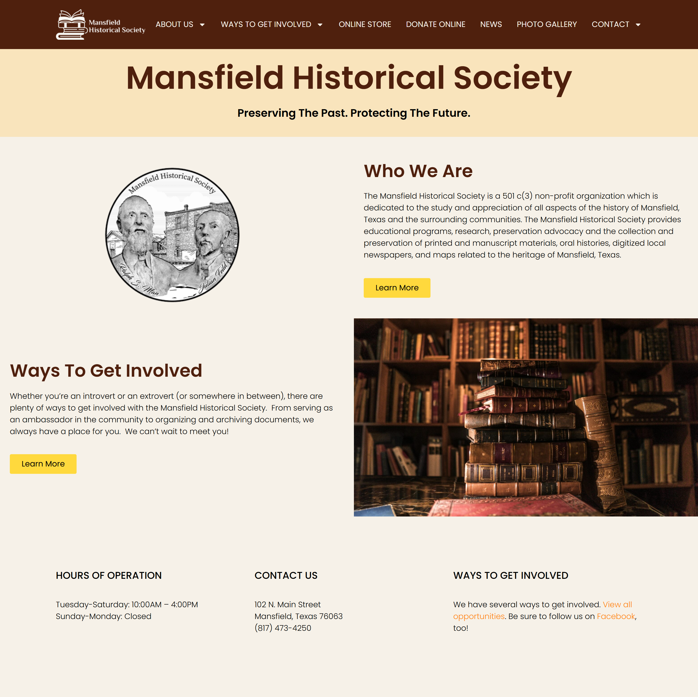
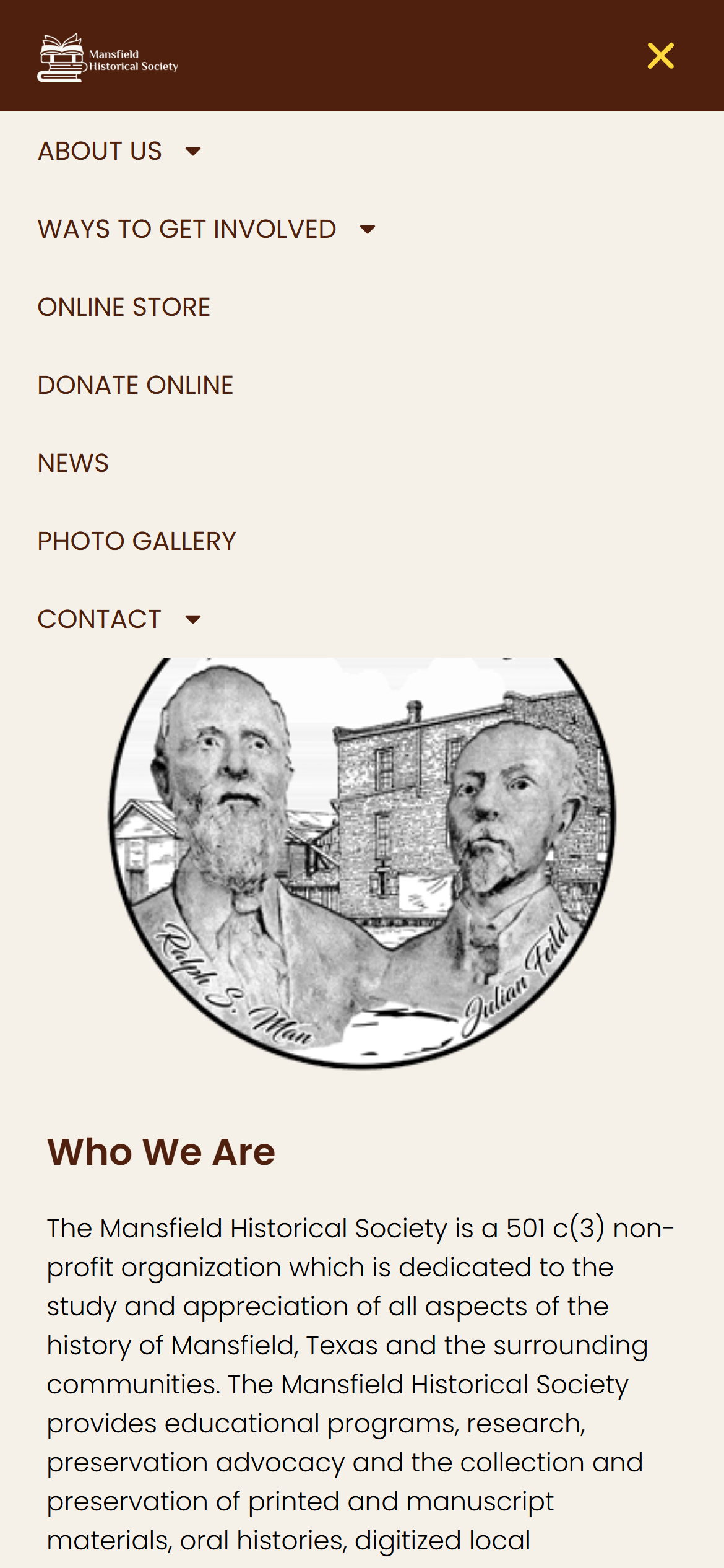
Simplified navigation lets members and volunteers complete key tasks in fewer clicks on both desktop and mobile.
Judgment Point: I intentionally deprioritized detailed historical content on the homepage to keep focus on task completion rather than narrative depth.
2. Accessible Visual Language
Typography, color palette, and layout choices were selected to improve readability and clarity for a multi-generational audience. Reducing cognitive load was a design requirement, not just an aesthetic choice.

Page layout and typography optimized for readability and clarity, supporting users of all ages.
3. Technical Platform for Long-Term Maintenance
Instead of a bespoke backend with higher future costs, I recommended and implemented WordPress:
- Empowers board/staff to maintain content independently
- Supports e-commerce, membership, and donation workflows
- Reduces dependency on developers while ensuring sustainability
This wasn’t the flashiest choice — but it ensured autonomy and longevity for the organization.
User Testing and Iteration
Before launch, I organized testing with core users (museum clerk and board members) and observed guardrails fail:
- Confusing labels
- Incomplete control workflows
By observing real sessions, I resolved errors before public launch — ensuring the site met real user needs, not idealized ones.
Results (Data-Driven Outcomes)
Eight months after launch:
- New memberships up 120% (reflects improved task flow)
- Online purchases up +70% (ecommerce is performing consistently)
- $5,000+ in gift shop & ticket revenue since launch
These aren’t vanity metrics — they are organizational outcomes correlated to UX changes.
What I Learned
This was my first ecommerce integration, which expanded my toolkit around payment gateways and digital revenue systems. But more importantly, I learned that:
- Aligning on priority tasks early short-circuits rework later
- User testing with people who don’t want to test reveals the biggest hidden blockers
- Design isn’t just visual clarity — it’s reducing regret and hesitation
Opens in a new tab. Site reflects ongoing updates by the organization.
You made something so overwhelming look so easy. Thank you!